Elude
ROLE
Lead Product Designer
TIMELINE
Three months
TEAM
Product manager, project manager and five engineers
SCOPE
Research, interaction design and delivery
Trip Summary Redesign
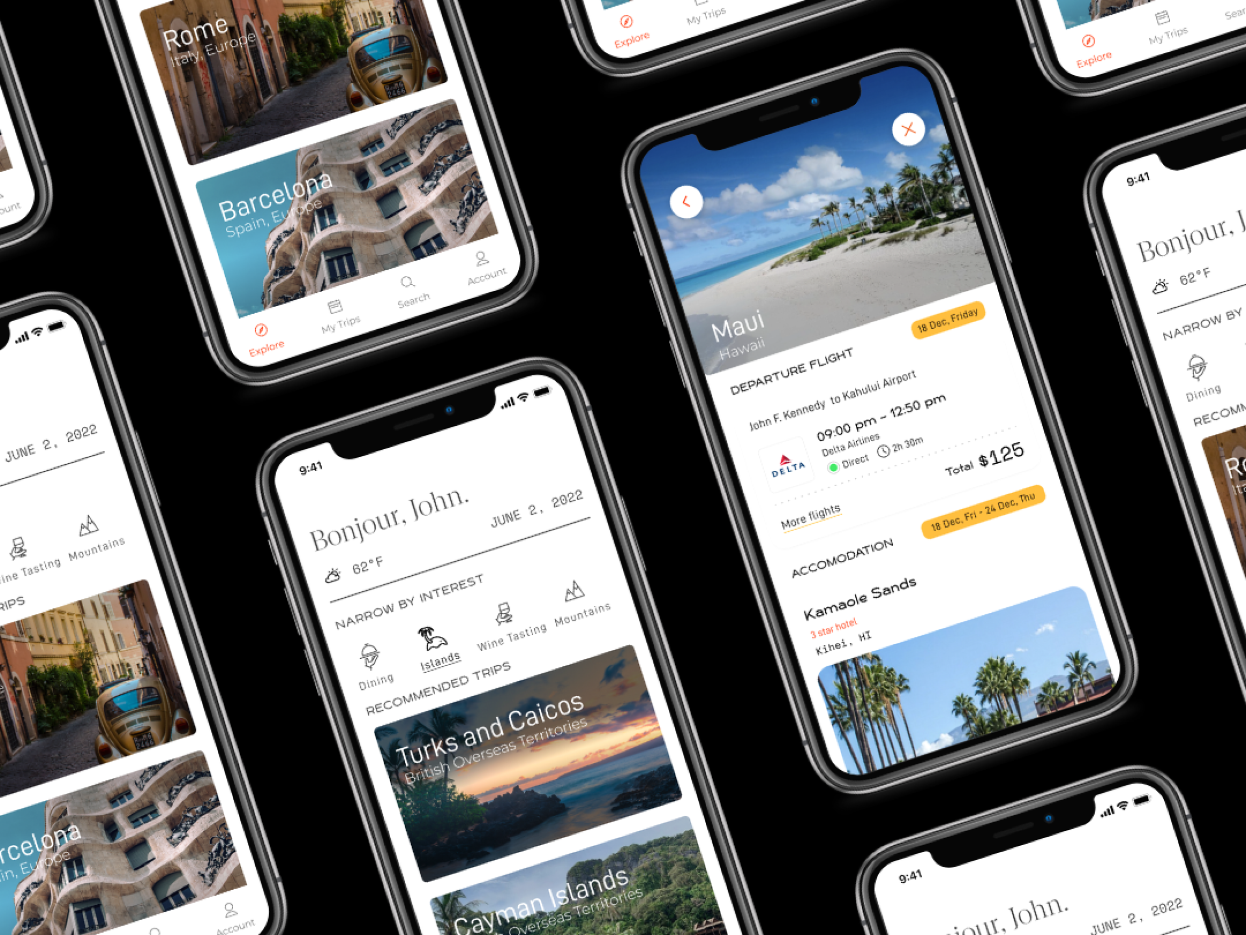
Elude helped travelers discover and book packaged trips based on their budget. Despite operating for more than a year, the company had not converted a customer search into a completed booking.
As the lead product designer, I owned a three-month redesign from research through launch. Through app-store reviews, competitive analysis, customer surveys, and 10 user interviews, I identified the trust and usability issues preventing customers from continuing beyond their search results.
I redesigned the trip-summary experience to clarify flight, accommodation, pricing, and next-step information. Following launch, Elude recorded its first completed bookings.
ITERATION AND DELIVERY
Balancing customer needs with implementation constraints
I reviewed the proposed flow and high-fidelity prototypes with product, project management, and our engineering team. These conversations helped us prioritize the changes that would have the greatest effect on comprehension and trust while remaining feasible within the three-month timeline. We couldn’t guarantee that the initial price would remain static, nor could we build out a new pricing architecture within the timeline.
With that in mind, I prioritized improvements that could be delivered without rebuilding the booking architecture. I focused on information hierarchy, pricing transparency, and navigation changes that addressed the product’s most significant trust issues.
FINAL OUTCOME
From zero completed bookings to Elude’s first successful conversions
Following the launch of the redesigned trip-summary experience, Elude recorded its first completed bookings after more than a year in market.
While the redesign was one part of a broader product and business effort, the result provided the team with its first evidence that customers could successfully move from trip discovery through booking.
It also established a clearer foundation for evaluating conversion, abandonment, and customer behavior throughout the rest of the booking journey.
Design Decisions
Turning research findings into a clearer path to booking
I focused the redesign on three principles: reduce cognitive load, communicate changes transparently, and make the next action unmistakable.
1. Establishing a clearer hierarchy
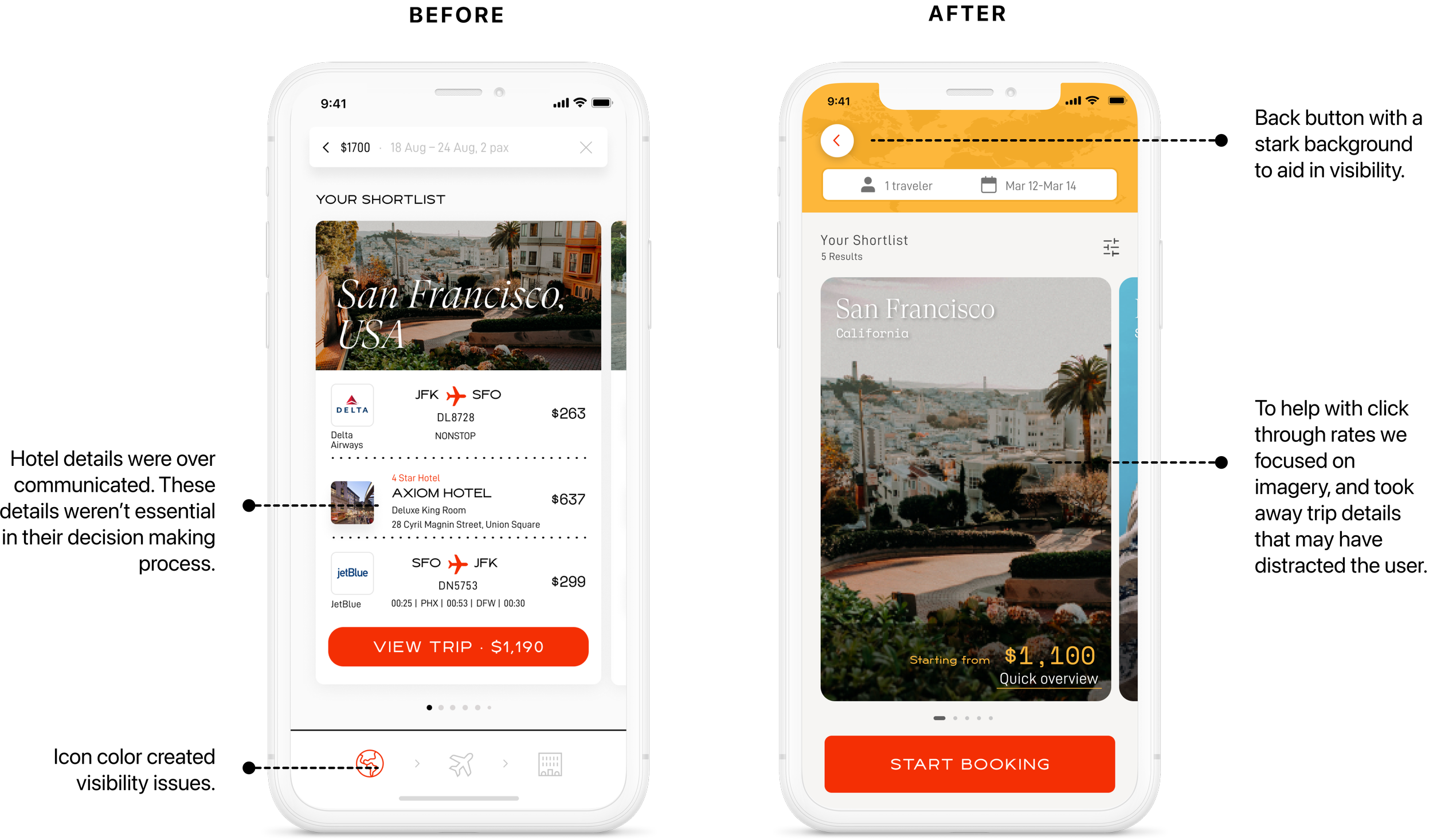
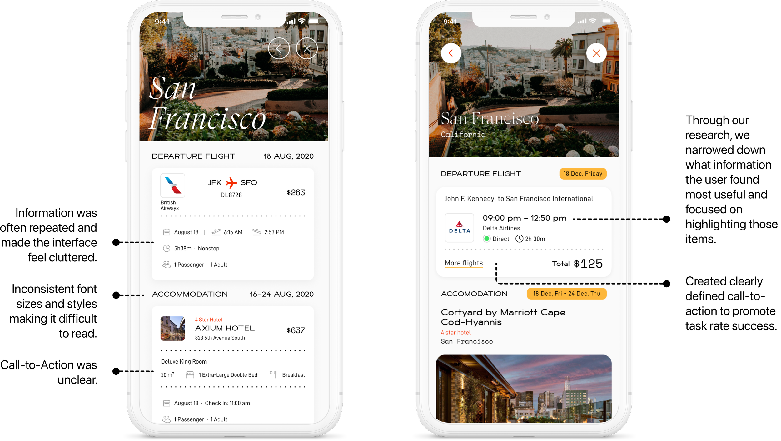
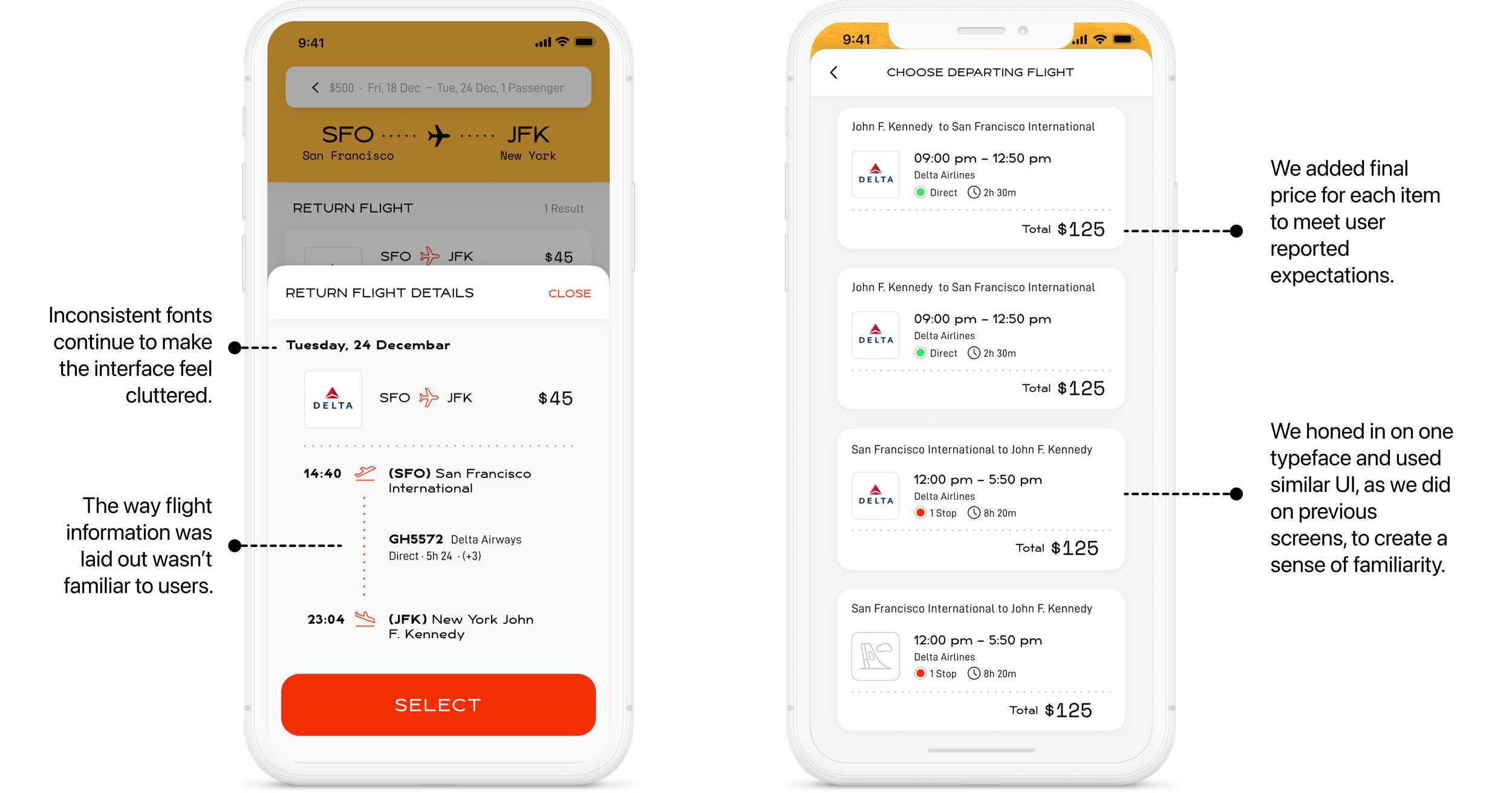
I reorganized the trip summary around the information customers needed to evaluate first, reducing competition between flight, accommodation, pricing, and supporting details.
2. Creating transparency around pricing
I revised the presentation and supporting copy to help customers understand that trip availability and pricing could change as they progressed through booking.
3. Clarifying progress and next steps
I aligned the navigation with the actual booking sequence and strengthened the primary action so customers could understand their current position and confidently continue.
I used Elude’s existing design system to develop high-fidelity prototypes, allowing product and engineering to evaluate interaction behavior, content, and technical feasibility together.

RESEARCH
Identifying the sources of customer distrust
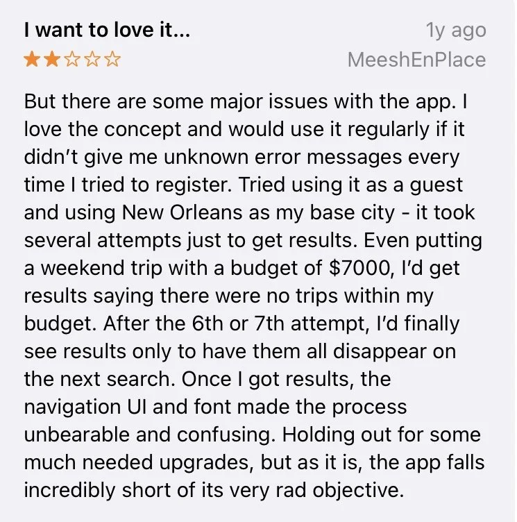
I began by analyzing app-store reviews to understand recurring frustrations with the existing product. I then compared Elude’s experience with established travel-booking platforms to examine how they communicated trip details, changing prices, and booking progress.
To understand the problem in context, I surveyed existing customers and selected 10 participants representing different travel frequencies, spending behaviors, and mobile platforms for one-on-one interviews.
During the interviews, I asked participants to search for and attempt to book a trip in the existing app. Observing their behavior helped me distinguish what customers said they wanted from the moments where they actually became confused, hesitant, or disengaged.
KEY FINDINGS
Three issues were preventing customers from moving forward
1. The trip summary created information overload
Flight, accommodation, amenity, and pricing details competed for attention, making it difficult for customers to identify the information they needed to make a decision.
2. Price changes weakened trust
Because flight and hotel availability could change, the displayed price could also change. Without enough context, customers interpreted these updates as inaccurate or misleading.
3. The interface did not communicate progress
The navigation suggested a sequence that did not match the actual booking journey. Customers were unsure about what they had selected, where they were in the process, and what would happen next.
REFLECTION
What I learned
This project strengthened my ability to synthesize multiple forms of research into a focused direction. The most important shift was moving the conversation from individual UI issues to the underlying problem of customer trust.
I also learned the value of involving engineering earlier. More frequent technical collaboration during exploration would have helped us identify constraints sooner and better evaluate solutions before moving into high fidelity.
If I continued the work, I would measure where customers still hesitated within the redesigned journey, evaluate comprehension of changing prices, and use those findings to improve conversion beyond the first successful bookings.
THE PROBLEM
Customers were searching—but not booking
After entering a budget and destination preferences, customers received a packaged trip containing flight, accommodation, and pricing information. Analytics showed significant abandonment at this point in the journey.
The trip-summary screen presented a large amount of information without a clear hierarchy. Availability changes also caused prices to fluctuate, making the initial result feel unreliable. At the same time, the navigation did not accurately reflect the customer’s progress through the booking process.
Together, these issues made it difficult for customers to understand the offer, trust the price, or determine what to do next.
ORIGINAL BOOKING FLOW
The experience did not support decision-making
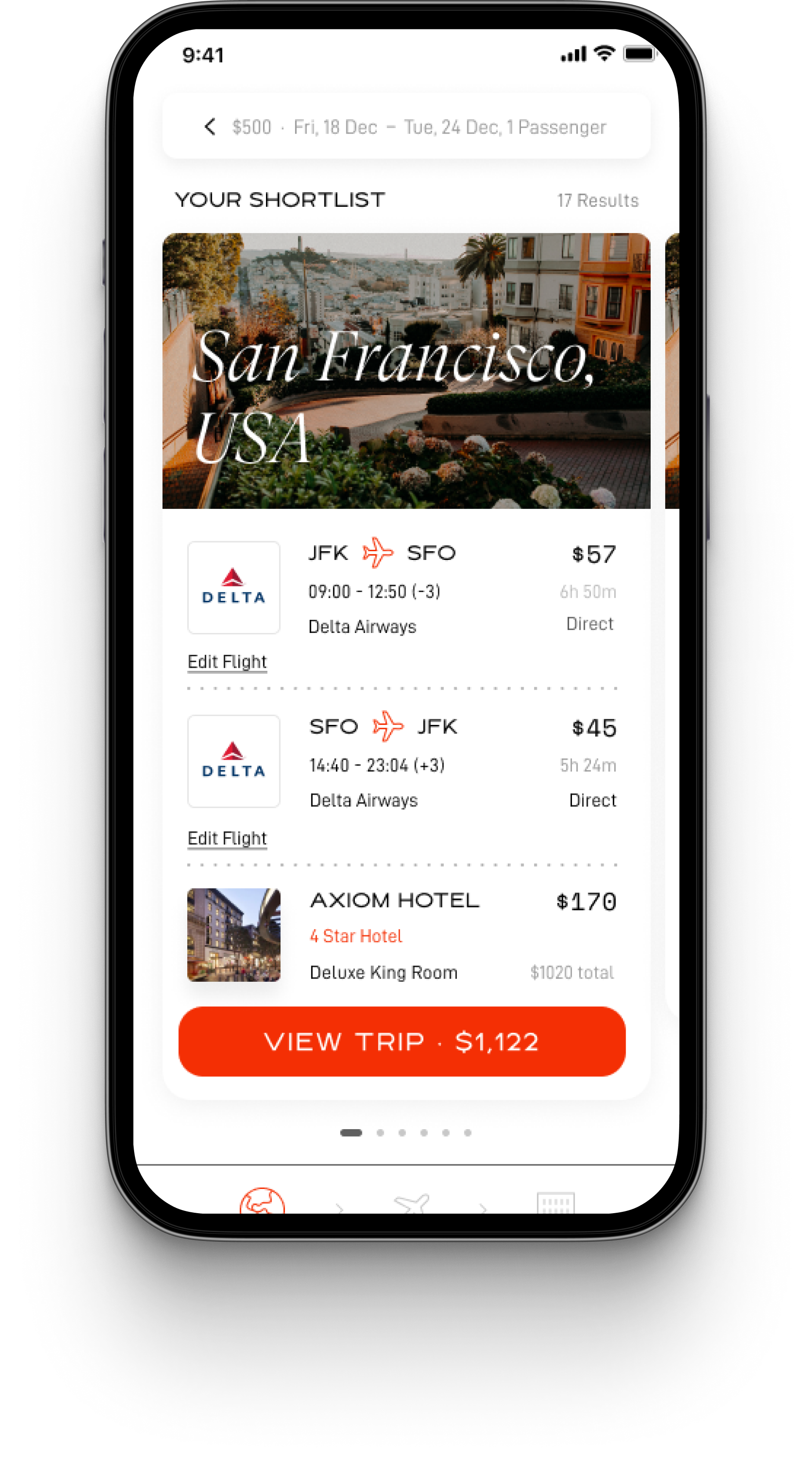
Information density made results hard to evaluate.
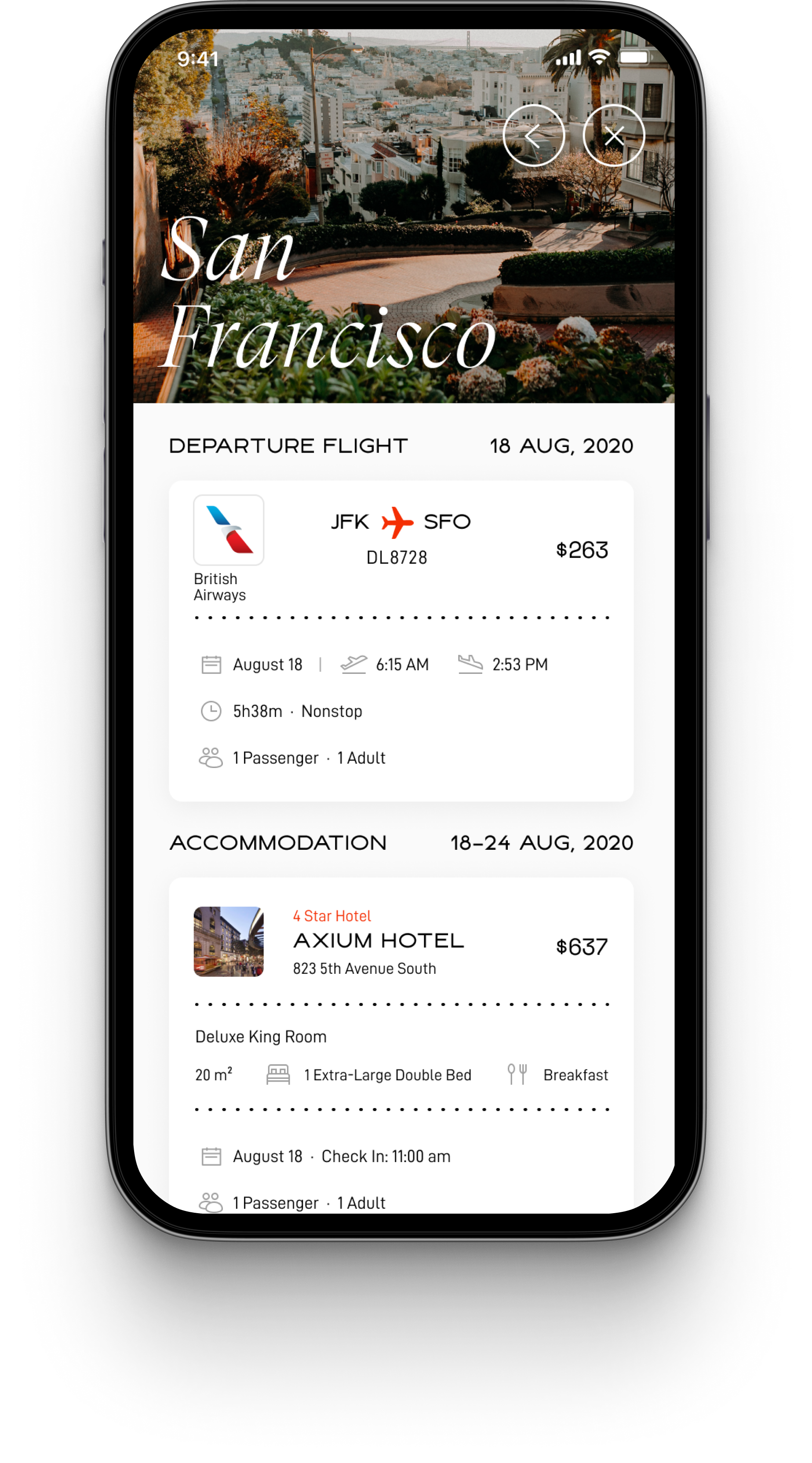
Next steps were unclear.
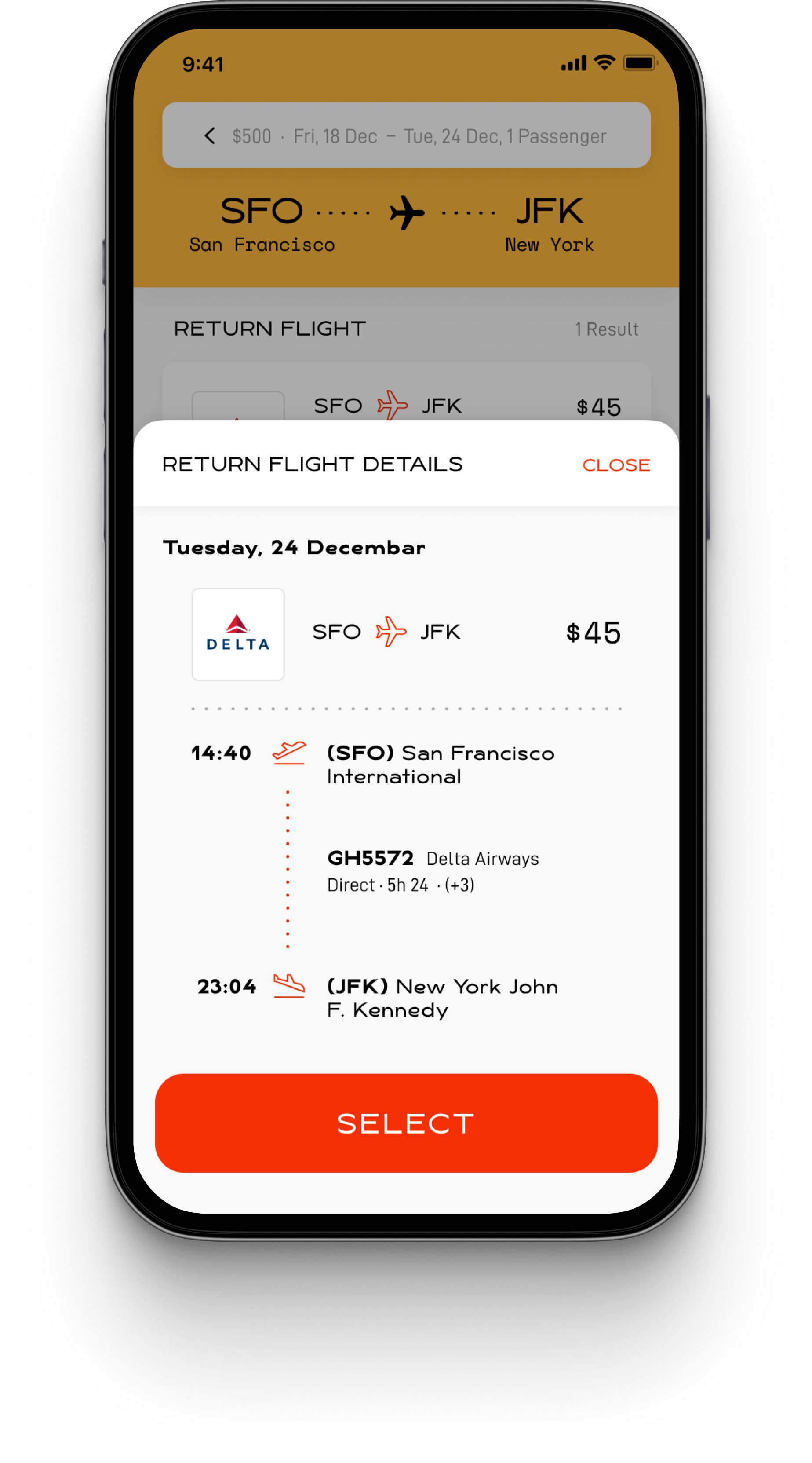
Information lacked hierarchy and price impacts were vague.