Retell

End-to-end design, from branding, to interaction, and prototyping for an online peer-to-peer resale and consignment shop.
Project Summary
The year was 2020 and we were seeing a steep decline in the sale of luxury goods.
What markets thrived during this slow economic growth period?
Resale and consignment.
As consumers’ need for luxury goods slowed down companies like, ThredUp, Poshmark, and Depop whose focus was on peer-to-peer resale and consignment, had their most successful years to date.
Deepening User Empathy
After conducting the research phase, I realized there were two strong-potential users so I developed two user personas, Ava Harper, and Allison Sable. Each persona’s needs and frustrations reflected an experience we needed to explore, and both would serve as a reference point for design decisions moving forward.
My Roles
User Experience (UX) Designer
User Interface (UI) Designer
Visual Designer
Tools
Figma
Invision
Team
Solo project
Academic project.
End-to-end web design.
Research
Because of my experience working in the fashion sector/e-commerce, I had pre-existing knowledge of a few key market trends within the industry —
During the political climate of 2020 consumers wanted their favorite brands to state their political stance, meaning it was important for the companies they shopped with frequently to share similar values with them
Younger consumers (Gen-Z and Millenials) valued inclusivity (sizing, gender, etc;)
Visual Design
Visually articulating all potential aspects of the Retell brand (product, as well as marketing and beyond) meant defining a baseline design system that identified key elements of its visual vocabulary. I wanted Retell's visual design to speak to trends within the largest consumer base, Gen Z.
A predominant palette built with earthen hues and naturally procured dyes reinforces the idea of an eccentric aesthetic, simple button states and clear iconography would help make tasks feel more manageable; and a single, modern sans-serif ensured legibility and clarity in messaging.
Developing our User Flow
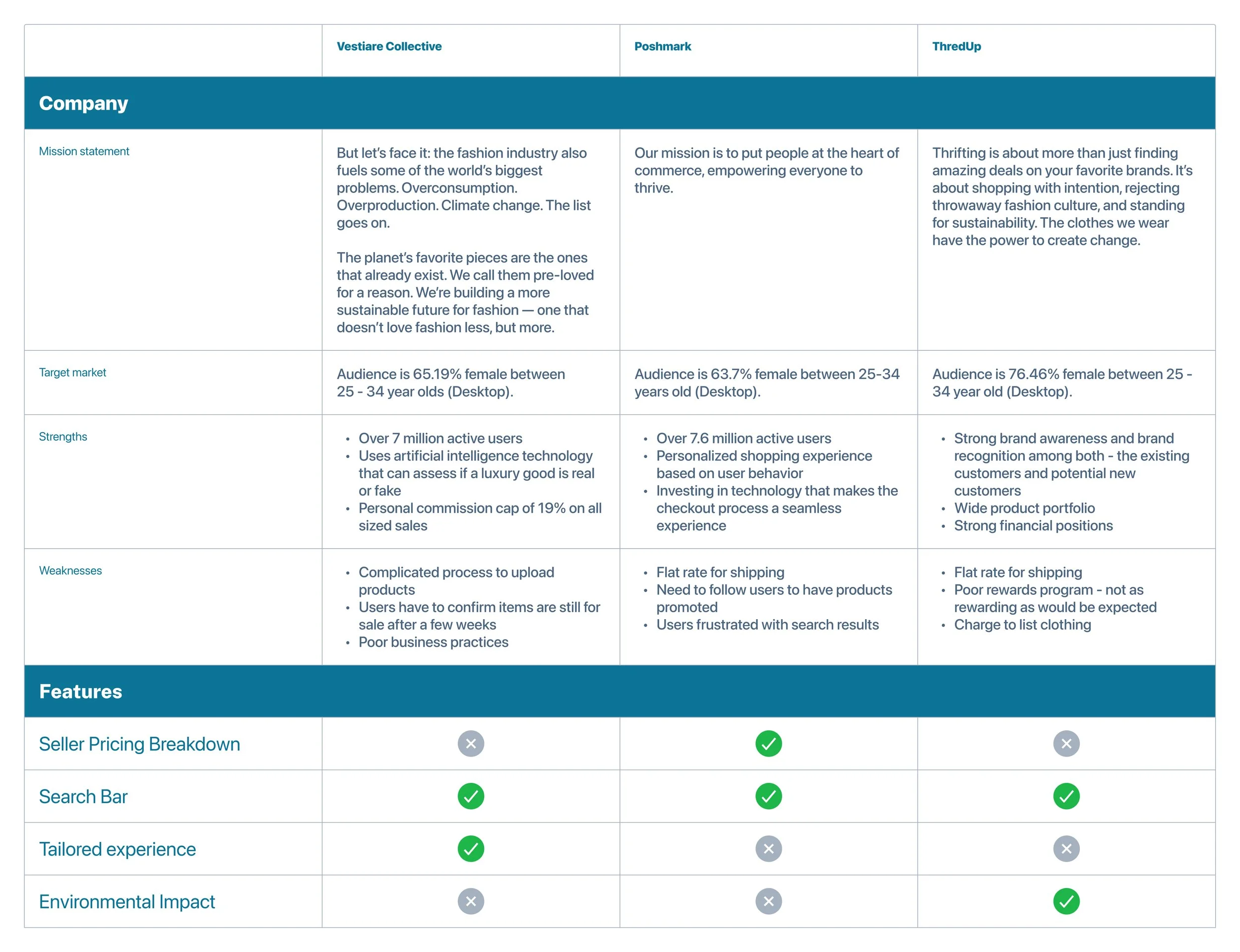
Competitive Analysis
To help narrow down the scope of my competitive analysis I selected three popular resale sites.
User Interviews
Ideally, I would have conducted contextual interviews to observe users while they go through the process of a potential buyer but due to Covid-19 social distancing guidelines, I was limited with my possibility of interactions. Because of that I settled for user interviews and worked with three potential users who met my specific criteria.
Each potential participant was sent a preliminary survey to assess whether or not they were strong candidates and potential users —
Users who resold items in the last year.
Users who fell into the age demographic of my target audience.
Users who use desktops to make purchases, more often than they did on their smartphones.
Insights:
As a seller, the lack of transparency regarding payouts and overall cost breakdown was frustrating.
As a buyer, a complicated or unclear point-of-checkout felt tedious and increased user drop-off rates.
Both groups of users valued global impact.
Resale often made them feel like they were minimizing their global impact, so they wanted companies to be more vocal about their business practices in hopes of backing up their beliefs.


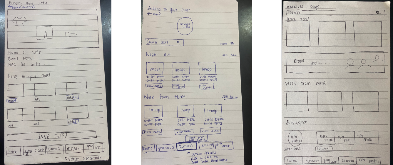

After mapping out our flow, and conducting our research methods, I explored page organization through low-fidelity wire sketching.
These rapid sketches allowed me to explore design patterns common among apps in the competitive landscape, helping me understand which features and design patterns I needed to carry into Retell to ensure familiarity, specifically when it came to the checkout and payout experience.
Wireframing

The buyer
The seller


Users said they wanted a simple user journey for uploading clothing items, they wanted to sell and make money — all within a few clicks. The flow to the right depicts that optimized and linear journey.
Users want a product that user predictive behavior to simplify the user experience. I plan to explore that closely during the build of the user checkout page. The user journey to the right depicts a simplified checkout process that uses collected data to enhance the user experience.
Allison Sable User Flow
The Seller
Ava Harper User Flow
The Buyer
I conducted an open card sort to get an idea of how users would group items when uploading them.
User interviews emphasized users’ values for a familiar experience, which meant I would need to follow existing UI patterns. Similar to the competitors I examined through secondary research, I would allow users to group their uploads by category to make shopping easier for buyers.
Below are the results of my card sort:

Drawing similarities through our interface

My first step was market research to understand market trends, and best practices, and to identify key players in the space. A competitive analysis would help me deep-dive into direct and indirect competitors. And lastly, I conducted user interviews with three users who had resold items in the last year. By doing so, I was hoping to understand users’ mental models and identify weaknesses and opportunities in the market.
Background
Putting the pieces together
Key Insight
Complicated points of checkout made users feel less confident about their purchases.
Through user interviews, we learned that potential users were frustrated by overly complicated checkout flows.
Things like adding expensive shipping fees or not allowing users to navigate between pages increased the likelihood of an abandoned cart.
With this understanding, I chose to hone my focus on the checkout and payout experience. What did it take to build a checkout process that felt trustworthy to the user but had little to no friction?
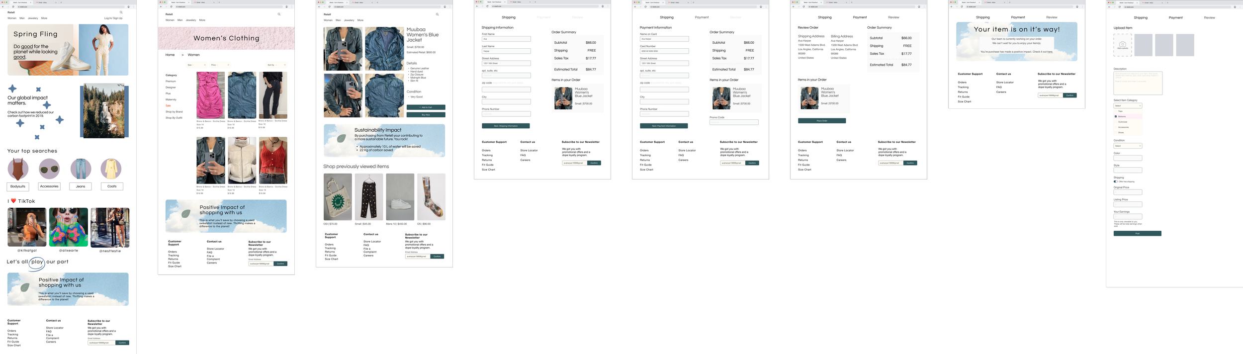
Medium-Fidelity Wireframes
Low-Fidelity Wireframes
Here is what I found…


Source : Shopify Checkout UX Guidelines
After narrowing down our problem statement, I circled back to external secondary research to gather data for our designs.
Below are common best practices for a seamless and efficient checkout system —
Problem Statement
Users of the e-commerce clothing industry are looking to minimize their carbon footprint, they’re looking for an eco-conscious way to purchase clothing.
Hypothesis
Create a brand whose visual identity matches the user’s ethos, while at the same time creating a seamless checkout experience that communicates with transparency, and feels trustworthy to the user.


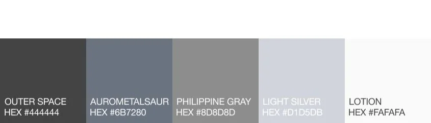

Color Palette
Typography
Usability Testing
High-fidelity prototypes allowed me to test the key user tasks I identified in my research.
A few users from my user interviews were unavailable, so I worked with a new user base. Consequently, that presented its own sets of challenges. However, it was a great way to have users with no preexisting knowledge of the project give feedback.
Here is what I learned through testing —
Precise language was important in completing tasks, users were reluctant to interact with the “Buy Now” button, fearing they’d be prompted to submit payment.
User Valued Icons accompanied by titles.
Formatting categories in familiar ways increased user efficiency.
Removing the navigation bar from the checkout process decreased potential user drop-off.
Evaluating impact
The next steps would be to identify the app’s impact and engagement. With user data in mind, I could better determine what future iterations might look like. Below are strategies to measure feature impact post-launch.
User activity
App usage stats
Adoption and usage data
Qualitative feedback from users

Final Thoughts
Challenges
This project was definitely challenging because from beginning to end, I had control of the brief and constraints. I knew that a market existed and that there were problems within the UX that needed solving but sometimes I doubted my own ideas and solutions. In those cases, I had to rely heavily on my research to confirm my thoughts and goals.
Lessons
During this project, my problem statement evolved as the depth of my research progressed. Getting caught up in the details of the product early on was not the most efficient way to work, since many of those ideas/stats ended up not being relevant. I had to remind myself to focus not on what the user said, but on what the user did. Observations through user testing gave me insight into how to build a stronger product.
Improvements
There are improvements that could be made in regard to the visual design aspects of the site. I love the idea of the color palette, but I do think there is room for the total of the UI to be perfected.