Elude
I was the main designer leading this project through ideating early concepts, running design sprints, presenting regularly to leadership, and delivering final assets for production.
Project Summary
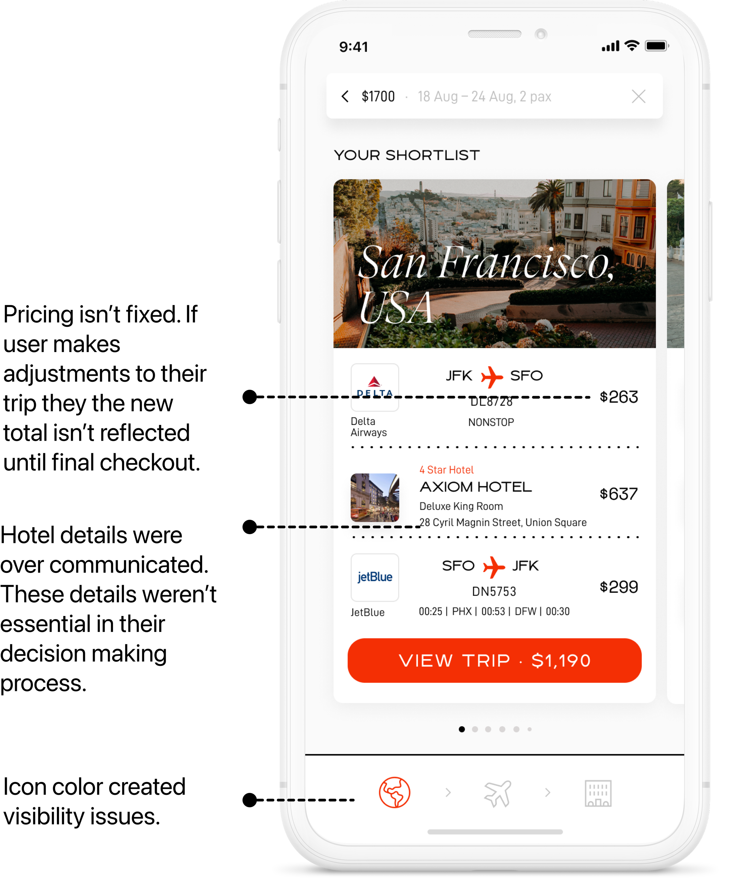
When a user searches for a trip, they’re presented with a packaged trip and are shown all essential information regarding flight and hotel details.
The company found that there was a significant drop-off rate after the users trip search. Our goal was to increase retention through a redesign.
Analyzing Product Prior to Redesign
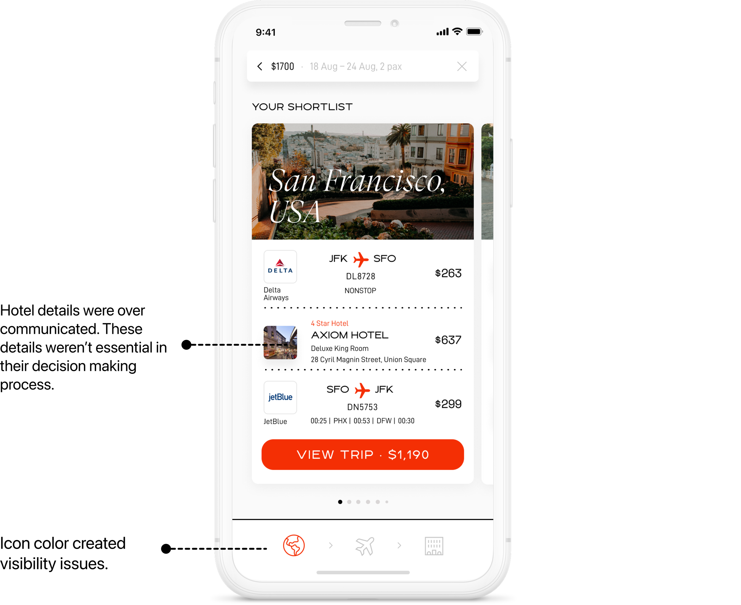
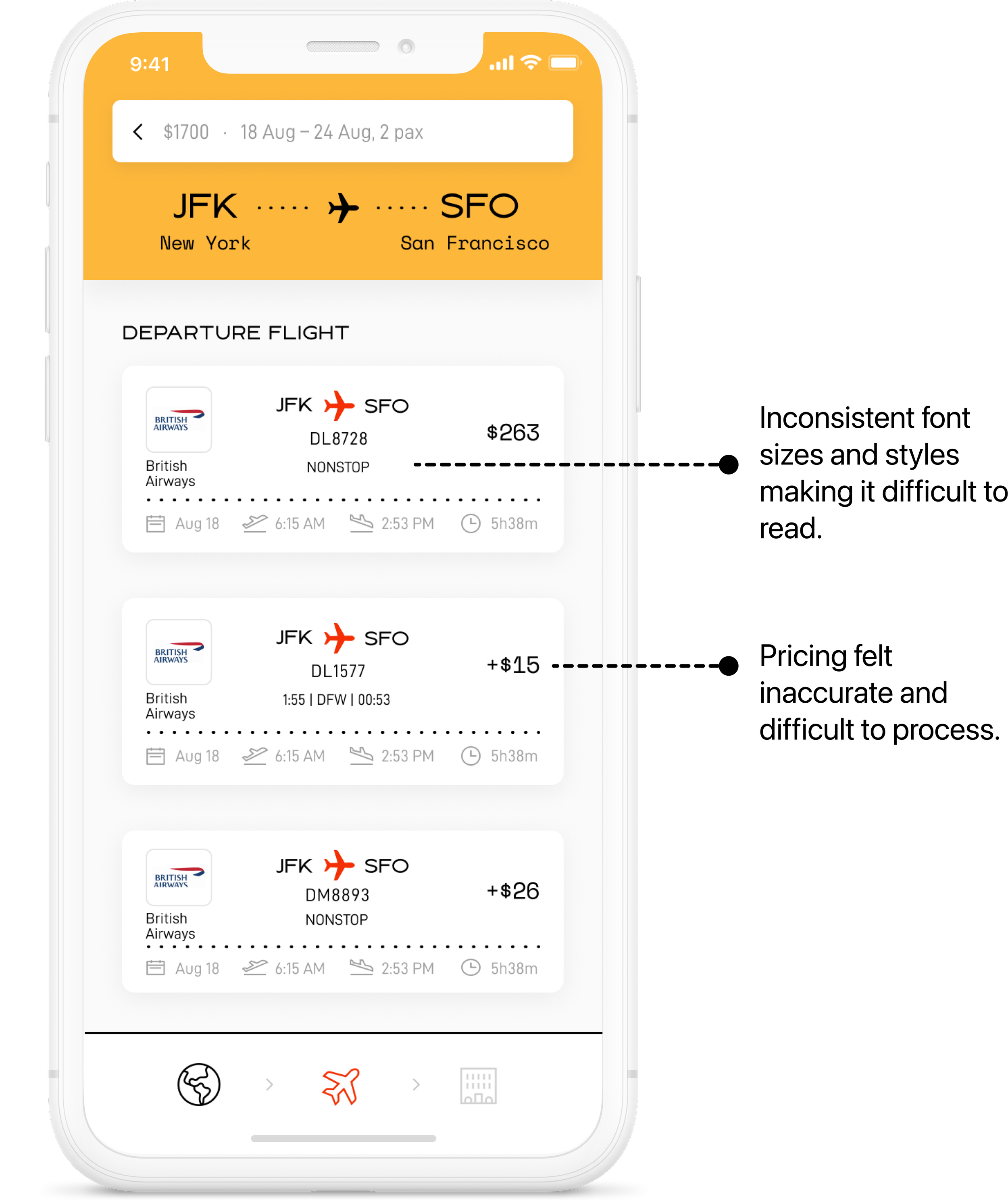
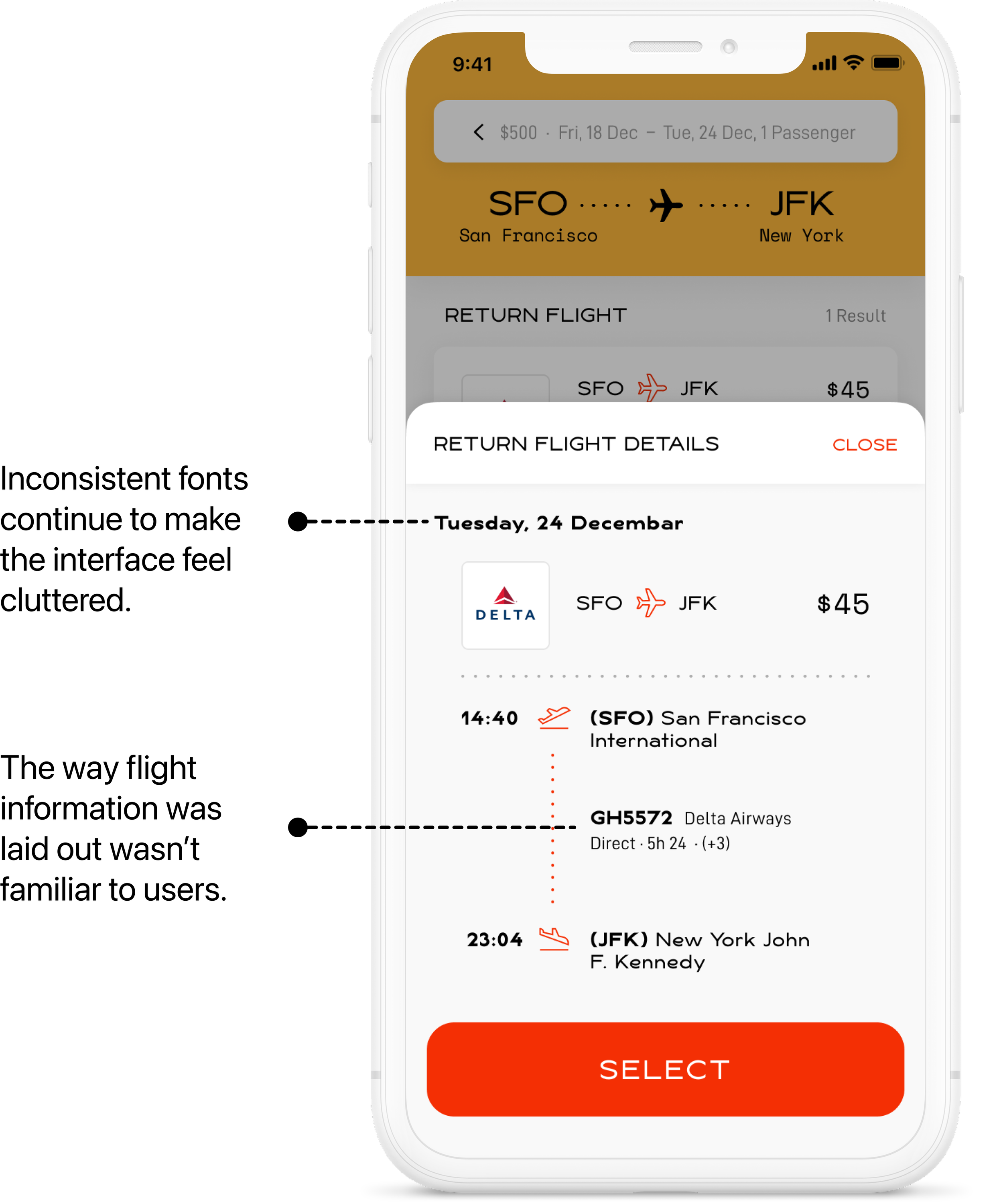
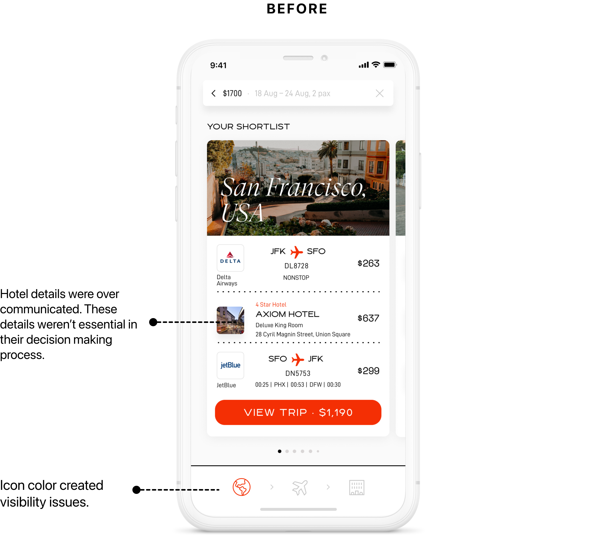
After gathering data and testing, we discovered that users perceived the app as cluttered and unreliable. This was because —
If their search query wasn’t able to yield results the user was shown a generic error message, instead of being given a clear reason on why and how to proceed
Since the trip details, such as; flight and accommodation can change and consequently so does the pricing, the initial price was perceived as inaccurate and therefore users questioned the integrity of the product
The users found the interface cluttered and not intuitive
Deepening User Empathy
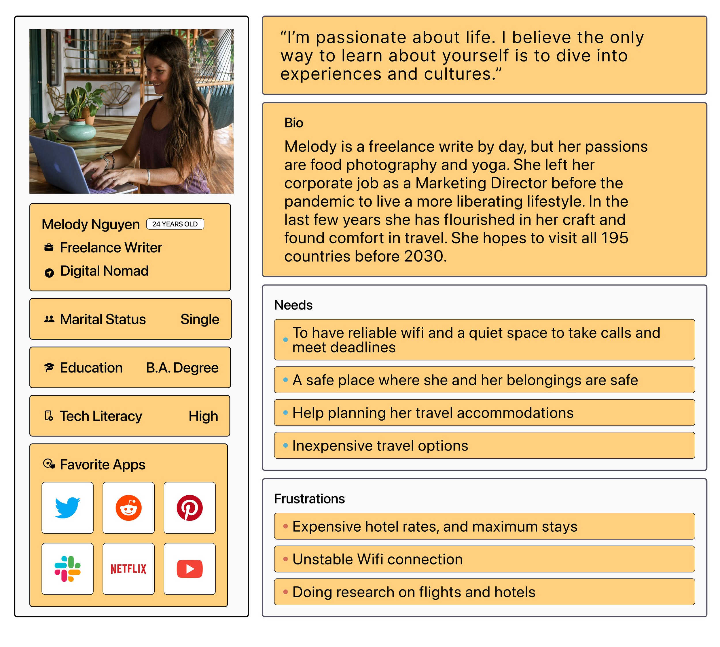
Now that I had a better understanding of how customers felt, I thought it was important to define our key personas to help drive our design decisions moving forward.
Defining the details of someone who was interested in luxury travel for leisure, and the “digital nomad” who most likely has simpler concerns in amenities, would help us design for a wide range of users.
Results
After a few revisions and collaboration between stakeholders, engineers, and myself we were able to come up with a journey and redesign that created retention, and increased user success rate.
After my redesign, we were able to increase the total number of bookings, which was a huge success. Below are a few milestones that were directly tied to the redesign —
NPS increased by 100%
Apple App Store reviews went from 1.8 to a 4.0
User drop-off rate decreased by 40%
Booking increased by 100%
Check out the final prototype to the right.
Design
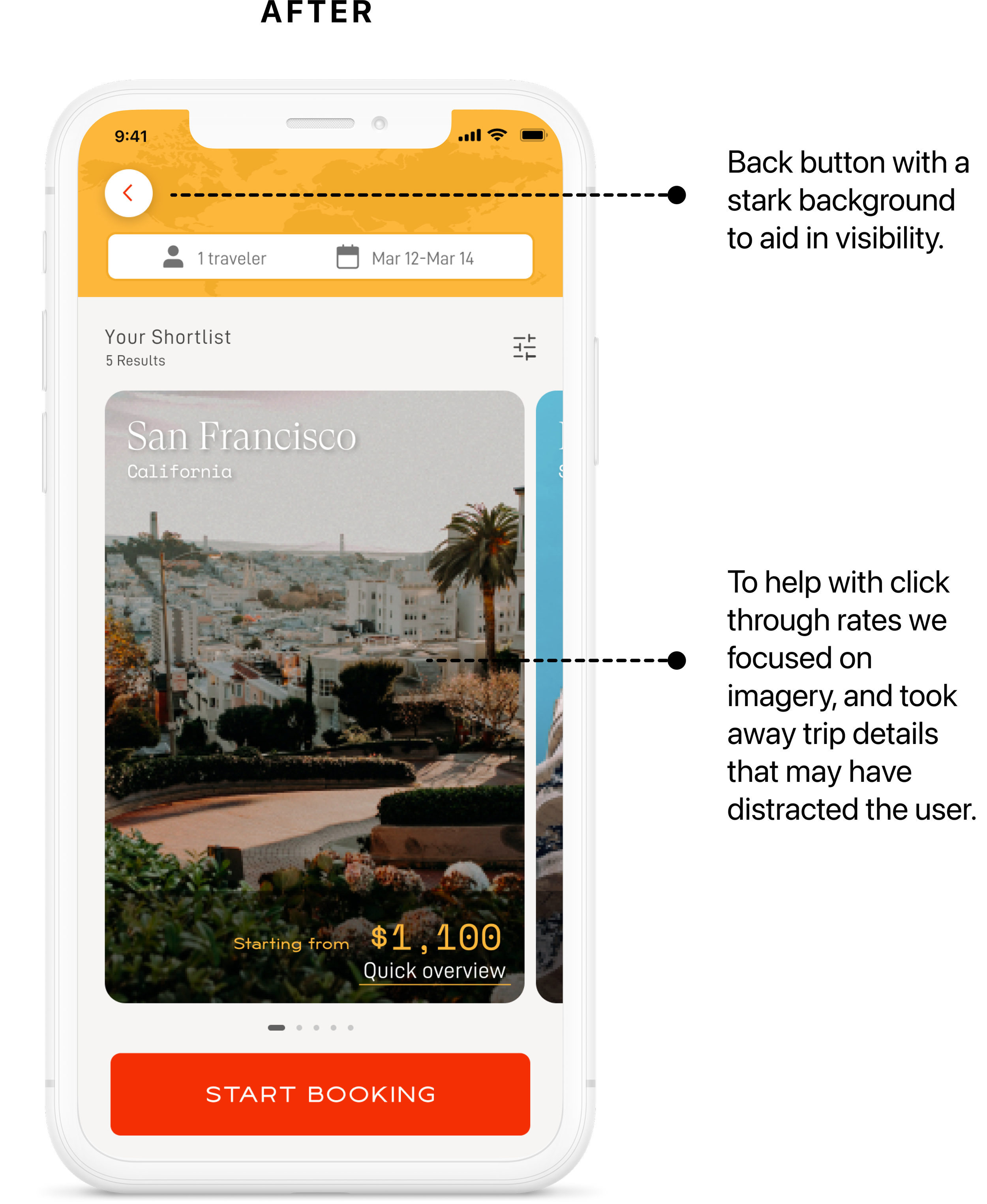
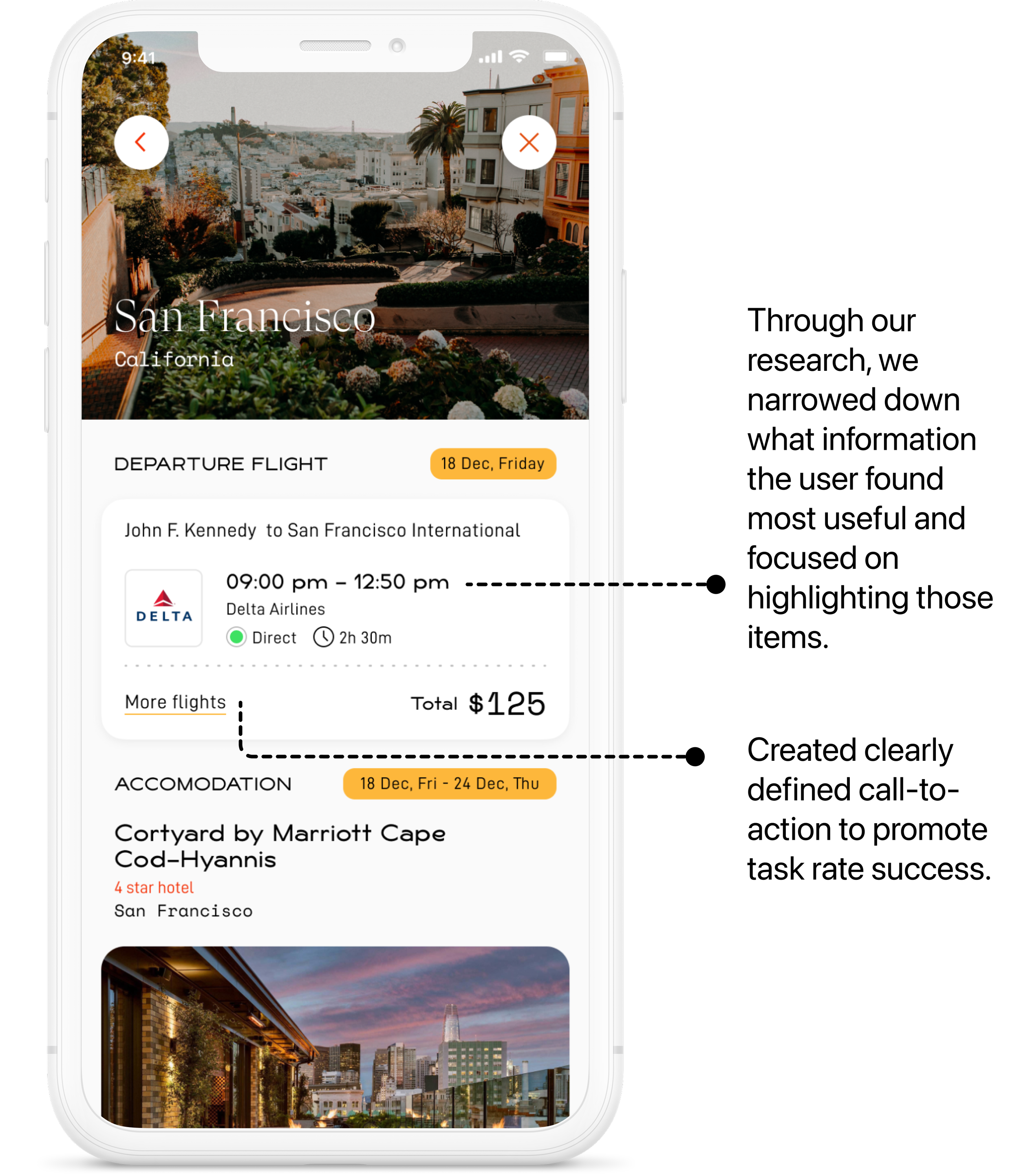
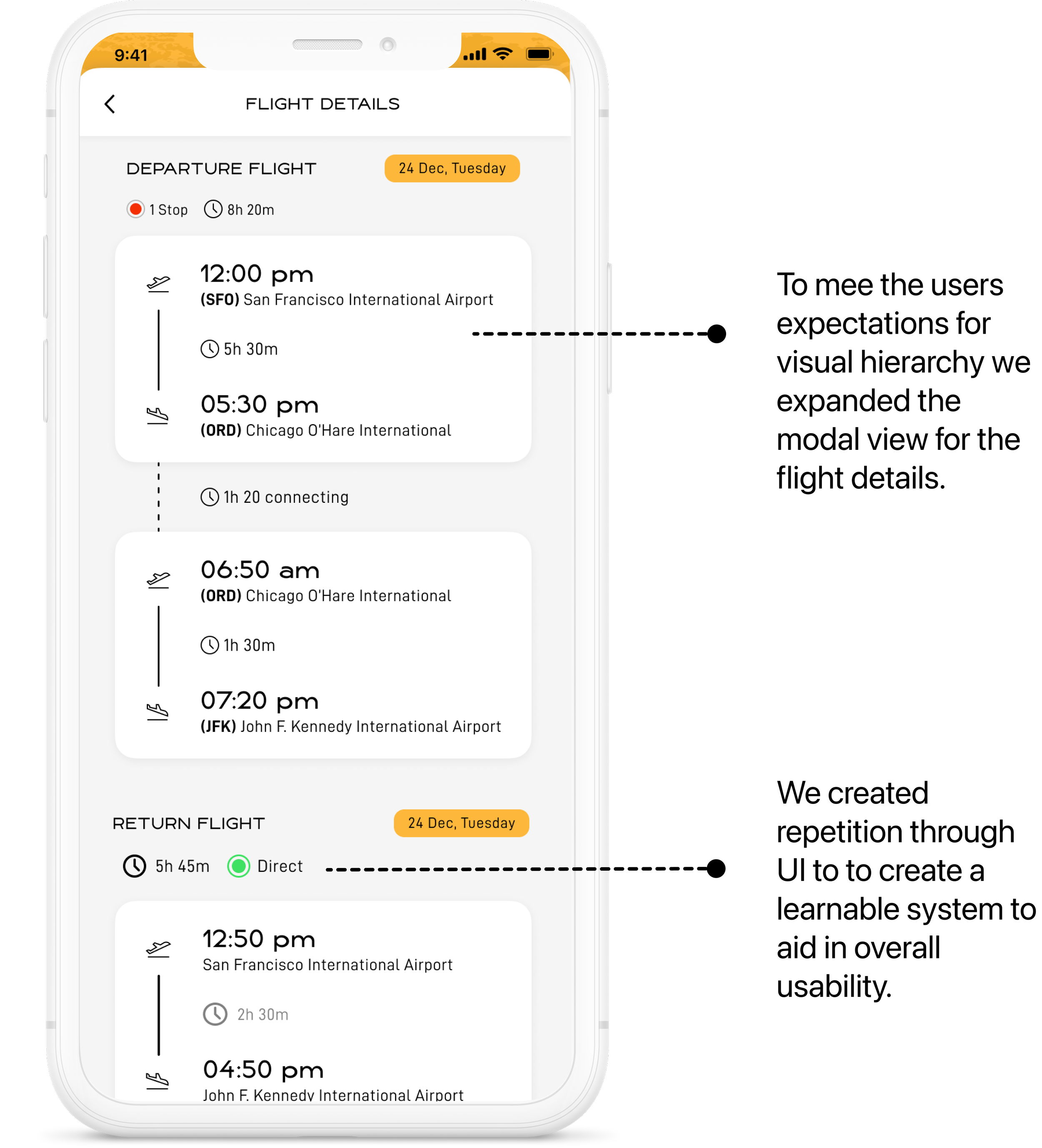
After carefully mapping out our flow, and conducting our research methods, we wanted to have a high-fidelity wireframe to present to engineers and stakeholders. Ideally, I would have created medium-fidelity wireframes at this point in this process, but due to time constraints and an agile project style, we moved into creating high-fidelity prototypes.
As the lead, I worked on prioritizing changes and creating a diligent process to ensure deadlines were met.
My strategy with these designs was to address the specific points of friction through careful attention to copy and to make sure the design patterns I’d apply were as clear as possible — and consistent throughout the experience.
Roles
User Experience (UX) Designer
User Interface (UI) Designer
Visual Designer
Tools
Figma
Illustrator
Miro
Balsamiq
Team
5 developers
Project Manager
Product Manager
Trip Summary Redesign
Research
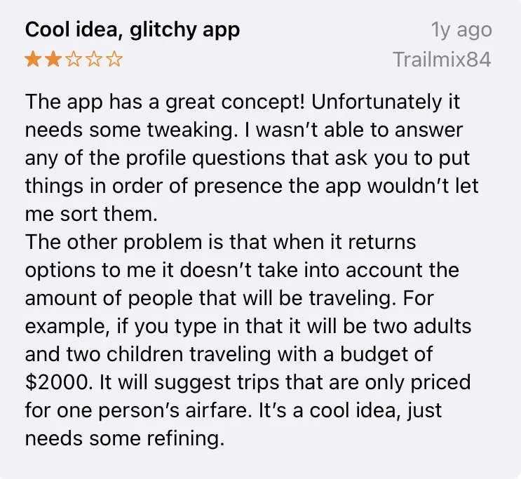
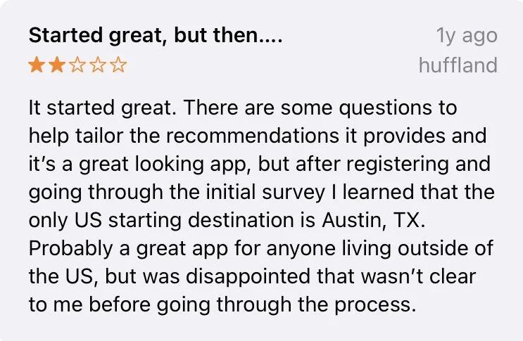
Firstly, my research consisted of a deep dive into our app store reviews which helped me gain a preliminary understanding of our user frustrations. As well as a competitive analysis to better understand and develop our user journey and create a unique yet familiar user interface. Lastly, I conducted one-on-one user interviews to gain qualitative and emotional insight.
App Store Reviews
User Interviews
I then emailed 100 of our earliest adapters and sent out a preliminary survey to gauge which users were the best fit for our user testing. We took into account how often users traveled, what their annual travel spend was, and whether they were apple or android users.
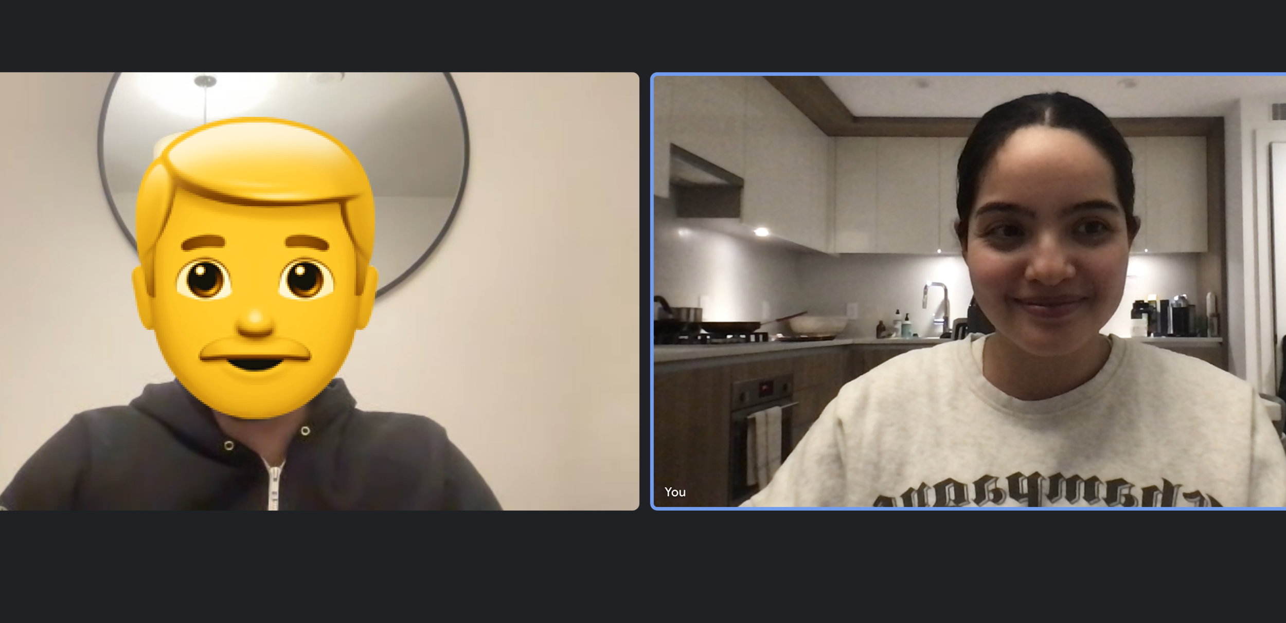
After narrowing down our group of users to 10, I conducted interviews with each one. I allowed them to search and book with the app to gain better insight into their mental models and the frustrations they go through when booking through our app.
Developing the User Journey
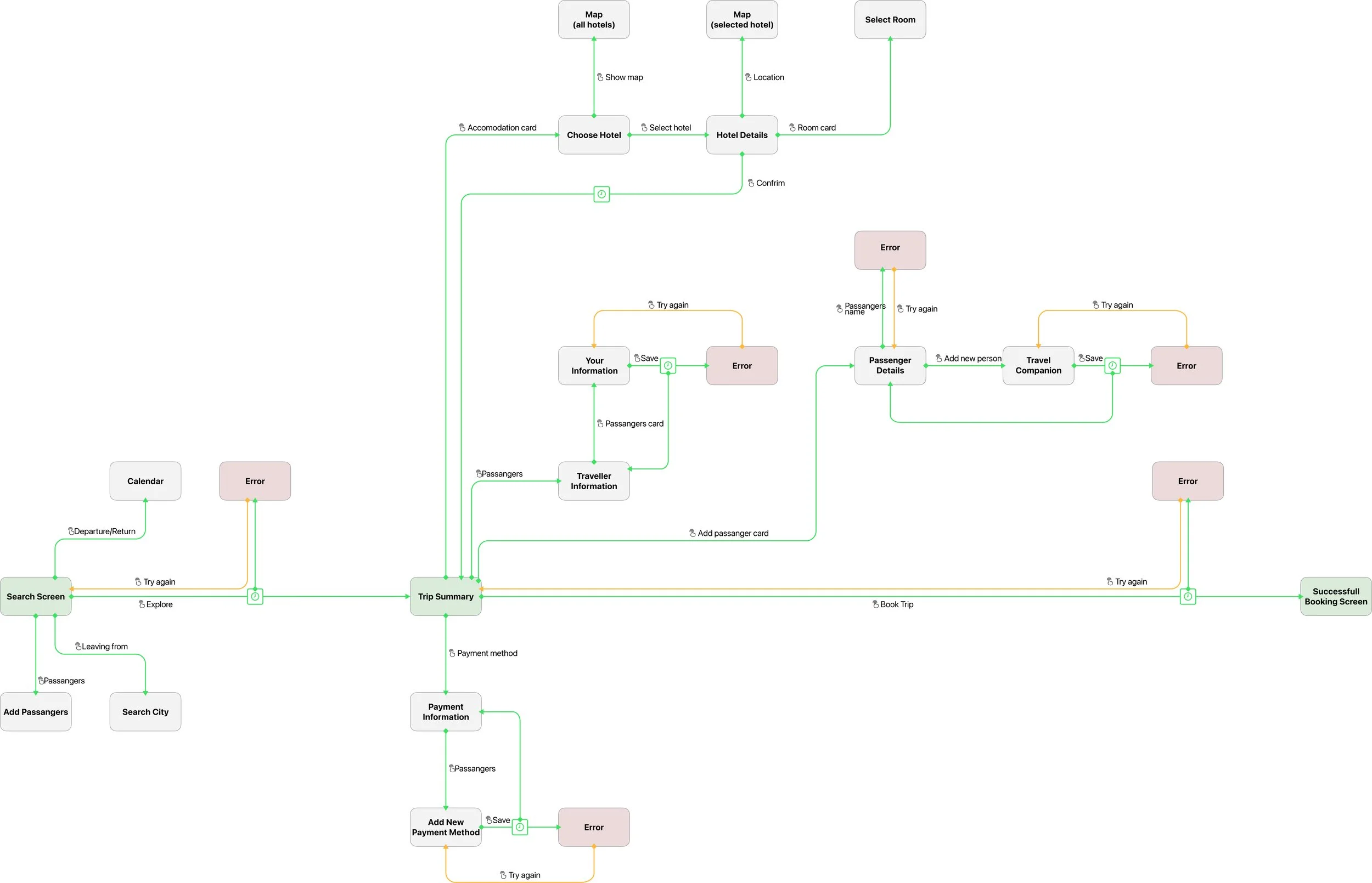
Now that we understood who the user was, what their needs were, and what was causing our existing users’ frustrations, I created the first user journey map. It was clear to me that the absence of a journey map was creating hiccups in both the user experience and causing disruptions in the implementation process with developers.
Thankfully, our user journeys between segment groups were very similar. However, their priorities revealed emotional nuances that would determine our design hierarchy later on in the design process.
Final Thoughts
Challenges
The most challenging part about this project was that this was the first time the company had conducted User Testing. I realized that as UX designer’s we know the value in testing, however, I quickly realized that it would be my job to prove to stakeholders and engineers the importance of following the statistical data collected. This meant I had to educate the team on the process of UX design alongside explaining my design decisions.
Lessons
I've learned that design is never linear but a continuous loop that we keep learning from. It's better to have a version you can iterate and improve on than to waste time on the minute details.
What’s next?
As I continue to work on projects at Elude, I would continue to build on the company’s personas to ensure we’re making product decisions based on their needs. In tandem, I would also revisit the brand mission statement to make sure the branding, such as typography and color choices, relay the message we aspire to spread.


